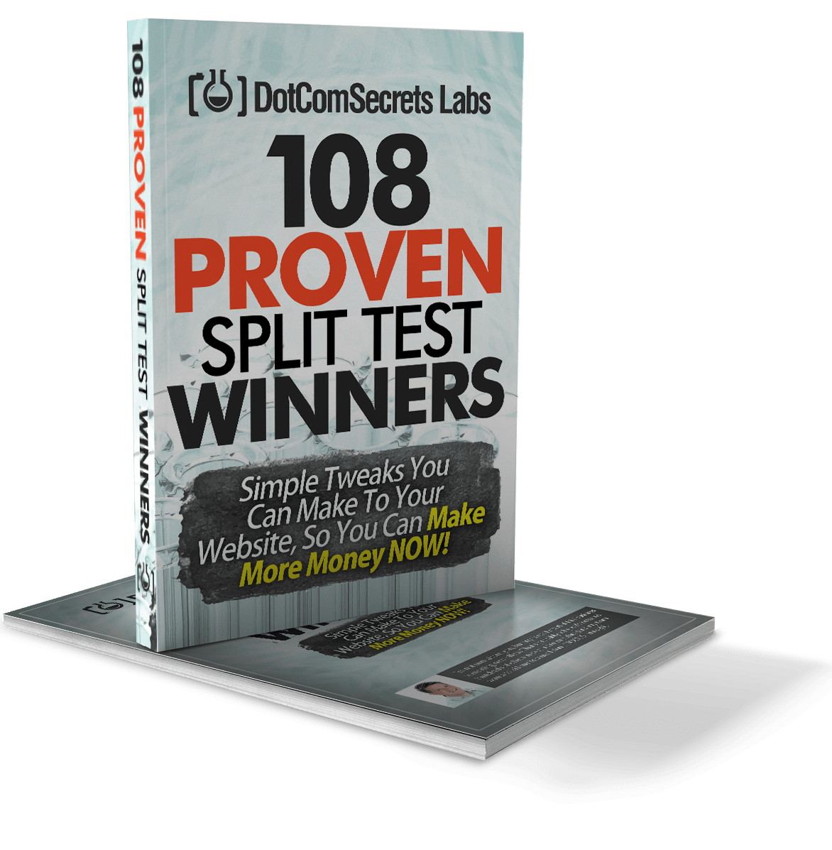
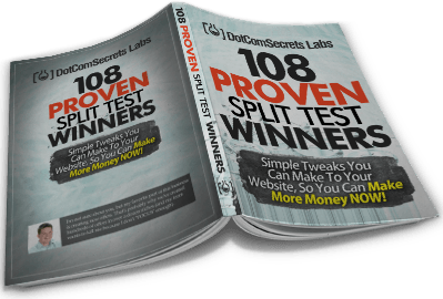
108 Proven Split Test Winners
"Simple Tweaks You Can Make To Your Website Funnel, So You Can Make More Money NOW!"


FREE Instant Access!
Enter your best email below and I'll send you a FREE copy of my new ebook, the "108 Proven Split Test Winners"

By providing us with your information you are consenting to the collection and use of your information in accordance with our Terms of Service and Privacy Policy.
Inside Of This Free eBook You'll Discover The Results To These Shocking Splits Tests:
- We added ONE tiny thing to our blog, and is making us $276 for EVERY thousand visitors we get to our blog... (this one is almost dumb, cause it's SO easy to add to ANY blog) (Page 9)
- "Buy Now" VS "Free Trial" - one of them will give you a 158.6% increase - do you know which one? (Page 10)
- When do you show your order form - screw this one up and you could lose 44% of your sales (Page 11)
- The secret "Bridge" page you should show BEFORE anyone sees your video sales video - by blocking your orders with this page before they see your message, you can see up to a 59% increase in conversions! (Page 13)
- The un-obvious price drop that gave us a HUGE 616.4% INCREASE in conversions and gave us 4 times as many customers! (Page 14)
- What we learned from a recent campaign that added 41,000 new members to one sites in just 30 days (Page 15)
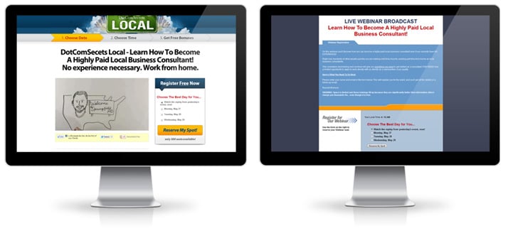
One Of These Landing Pages Had A 18% INCREASE In Optins, But A 31% DECREASE In Sales... Can You Guess Which One (and WHY)? (Page 75)
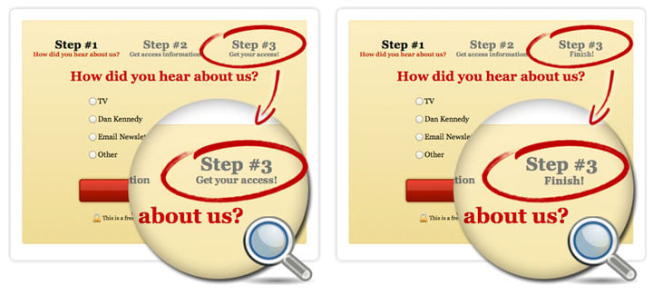
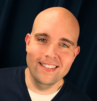

This Test Even Got Jeremy "Shoemoney" Excited!
- The mobile responsive squeeze page SCAM... don't listen to the "gurus's".. we did, and it killed our conversions by 83%... (Page 17)
- Where do you put your testimonials? Did you know that the location on the page you place them can actually INCREASE conversions on your VSL by 101% Yes, twice the number of sales without touching the VSL! (Page 18)
- The strange "Mad Libs" style squeeze page that increased conversion by up to 40%! (Page 19)
- We know it's essential to make your order forms secure, but did you know that making your squeeze pages secure can increase option conversion by 29%? (Page 20)
- Boobs VS Obama - which one wins? Knowing this could help give you a 45% conversion on your next landing page! (Page 21)
- Animated VS Static headlines... one of them will DROP your conversions by 29% - MAKE SURE YOU DON'T USE THE WRONG ONE. (Page 22)
- Offer this ONE THING for free - and see in INSTANT 55% boost in your sales! It's so easy you'll be shocked you missed it before. (Page 24)
- Should you change your offer by traffic source? YES! - Traffic from Facebook that saw this tiny offer tweak increased conversions by a WHOPPING 75.6% - yet it HURT conversions from our other traffic sources. (Page 25)
- The TWO magic words (next to your order button) that increased conversions by 28% (Page 27)
- Selling SAAS products? Should you focus on the length of the trial or the speed of singing up? One of them will increase your conversions by 30% - the other will slow signups to a screeching halt. (Page 27-28)
- How simple is your design? - cutting these 20 items OFF your landing page will increase conversion by 21% (Page 29)
- Oh ya... and did I mention that I actually GIVE you the sales script that we used that took my company from 7 figures a year... to 8 figures a year! (Just give this to any sales person and watch your business EXPLODE!!!) (Page 85-87)

The "Facebook Testimonial Trick" that increased sales by 296% (Page 58)

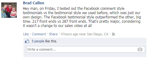
I Showed This ONE Test To Brad Callen, And Check Out His Results:
Hey man, on Friday, I tested out the Facebook comment style testimonials vs the testimonial style we used before, which was just our own design.
The Facebook testimonial style outperformed the other, big time!
217 front ends vs 287 front ends.
That's pretty major, considering it wasn't a change to our sales video at all!”
- A few order button delay tests on VSL... this goes against what EVERY guru has been teaching for 3 years... (Page 38, 49 and 72)
- Adding these 7 things to your light box pop-up increased conversions by 67%! Ignore these at your own peril. (Page 39)
- Do coupons boost sales on Facebook? Or will they actually hurt you? Shocking proof that will change how you market on Facebook. (Page 40)
- A new take on your P.S. that gave us an amazing 63% increase in conversions! Adding this small element can take you just a few minutes, but the effect on your wallet will last a lifetime! (Page 41)
- A widget you can embed on your VSL page that will give you an instant 5% bump without you needing to do anything except copy / paste. (Page 43)
- Is content killing you? We removed 75% of our sales page and increased conversions by 80%. Make sure you aren't including this on your website or you may be pushing away more people then you are attracting. (Page 44)
- Check out this RADICALLY different (and kinda CREEPY) landing page background that gave one SAAS company a 103% increase in new customers literally overnight! (Page 45-46)
- After being told that this headline tweak would INCREASE conversions, we were shocked to see it dropped our conversion by 16.36%... BEWARE of who you're getting your testing advice from! (Page 50)
The "Video Spoiler" box that increase sales on our VSL by an incredible 73%! After we learned this one, we added it to every VSL we had and saw very similar bumps! (Page 62)
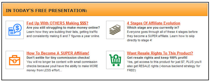
- The "Webinar Recap" block that increased our post webinar sales by 119.51% - It increased our revenue per webinar registration from $4.57 to $10.04!- AMAZING considering we didn't change ANYTHING on the actual webinar! (Page 51)
- That BIG ANNOYING button that raised our conversion by 25%! (Page 52)
- What color is your headline? If it's matching your site design, it's probably HURTING your conversions. Change them to this color and see an almost INSTANT 313% increase! (Page 53)
- DON'T SCARE COLD TRAFFIC - taking this OFF of your site will show you a 10% increase to all forms of cold traffic. (Page 54)
- This new "Micro-Commitment" style squeeze page gave us a 95% lift over our old control (which we had tested for years, and assumed was unbeatable) (Page 56)
- Everyone says that "Trust" seals will increase your conversions, but you'd be *shocked* to find out the REAL stats that they don't want you to know about. This 14% DECREASE will make you a believer. (Page 57)
- The Affiliate Hack you can add to any of your webpage that will get an instant stream of new affiliates to promote your products with out ANY extra effort! (Page 59)
- The Facebook / Order Form Trick - this one took 36 seconds to add to our order form and gave us an 80% increase in sales! (Page 60)
- The "Hot List" pre-frame to take someone to BEFORE they get to your order form that causes MORE buyers NOW! (Page 61)
- Adding the "Calculator Close" above our order buttons gave a quick 8% bump in sales! (Page 62)
- How big is your sales video? Did you know that the dimensions have an IMMEDIATE impact on sales? We made this tweak and saw an instant 31% increase in sales! (Page 63)
- Should you have a pause button on your VSL? Should you do just text, or text plus video? Should I offer split pay? Delayed order button? These 9 tests will show you the PERFECT winning combination! (Page 64)
- Should you delay your order button on upsells? Screw this one up and you will LOSE 188% of the profit you could (and should have made). Despite my best guess, I got this one DEAD wrong. Do you trust your guess? (Page 65)
- We added this option to our OTO page and NO ONE took it, but when we took it away our sales DROPPED by 15%. Learn how you can add this Decoy to your OTO page and instant increase your sales! (Page 66)
- This test was very controversial and went AGAINST what a few top Guru's have been preaching when it comes to Facebook Connect. We tested the OPPOSITE of what everyone was saying, and I was SO glad we did - because we saw a 65% INCREASE in optins when we broke "their" rules. (Page 67)
- One small thing we added to our automated webinar registration pages that pulled out our buyers FAST and had them purchasing BEFORE most people ever saw the webinar... (Page 68)
- We added this "Testimonial Graffiti" to the white areas on our order form and saw a 44% increase in sales! (Page 69)
- The payment options trick that gave one of our readers a 217% INCREASE in sales! (Page 71)
- ONE word on our squeeze page that increased optins by 206% (page 73)
- Changing ONE number in our headline gave us a quick 34% bump. (Page 74)
One of these webinar registration pages INCREASED our conversions by 29.45%. Can you guess which one? (it'll probably make you angry at first, and then happy later because you'll be able to fire your designer!) (Page 55)
- A new order form tweak that increased sales by 76% (Page 76-77)
- Should you do a 7 day trial or a 30 day trial? One of them will give you a 110% increase - can you guess which one? (Page 78)
- All free trials are NOT equal... Should you require a credit card or not? One option resulted in 50% MORE paid customers. (Page 79)
- One slide I added to my webinar that gave me a 25% INCREASE in sales (You can put this into ANY presentation and see similar results). (Page 81)
- The PayPal trick we use on our webinars that instantly put 35% more money into our pockets! (Page 82)
- The tiny "Offer Tweak" that gave one of our friends a 109% INCREASE in sales! (Page 83)
- Are your customers afraid to buy online? Add this to your site and get 65% of those people to buy INSTANTLY! (Page 84-85)
The secret "Toilet Letter" that increased our LIFETIME Customer Value from $150 to $450 - (I'll actually GIVE YOU THE LETTER we used! Just tweak it for whatever you sell and watch the money pour in!) (Page 88-93)
So, What's The Catch...?
I know there are some websites out there that offer you something cool for free, but then stick you into some program that charges your card every month.
This isn't one of them.
There's NO hidden "continuity program" - and in case you're wondering why I'm doing this...
Well, there are actually a few reasons...
1. It's my way of saying thank you for being a dedicated subscriber.
2. Because (unlike other "gurus") I don't make all of my money teaching others how to make money (I actually run real businesses online selling software, supplements, physical products and more)... so because of that, it doesn't hurt me to share with you my best stuff.
3. I get another one of my products in your hands, and when you see how awesome it is, it should get you excited to buy other stuff from me in the future. The more money I can make you now, the more likely you are to join my $25k Inner Circle program in the future.
4. I'm kinda a show off... I'm not going to lie. I'm sick of people throwing out conversion numbers and their stats without any real proof to back it up. I think 99% of what is said online is complete BS... so I thought it would be a breath of fresh air to publish the TRUTH, show the actual stats and #'s behind what we do, and well... honestly, I just want you to think I'm cool. :)

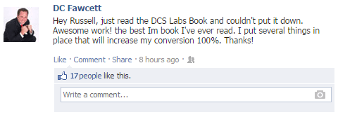
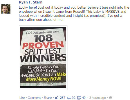
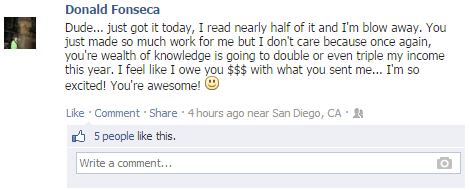
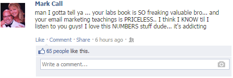
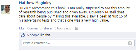
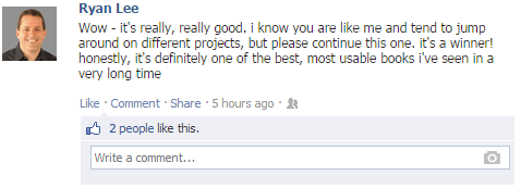
Just See What Others Are Saying About This eBook!


Here's What You Need To Do Right Now!!!

From here it's just finalizing the details. Click on the button below, and we can finally get started!
Thanks for taking the time to read this letter and I look forward to hearing from you soon!
Thanks,
Russell Brunson
P.S. In case you're one of those people (like me) who just skip to the end of the letter, here's the deal:
I'm giving you my new book, "108 Proven Split Test Winners" along with a bunch of gifts FOR FREE! Just let me know what email address to send it to, and I'll send you a copy right away!
No tricks... no games. (Are you ok if we overdeliver...?). ha ha...
Sound fair? Then what are you waiting for!?! Click on the button below right now:
Etison LLC - © 2021 All Rights Reserved | 3443 W Bavaria St Eagle, ID 83616
CUSTOM JAVASCRIPT / HTML

